Wednesday, 7 November 2012

Bethany Parker AKA Cara Red
Cherry Pop Latex

Li Wong
Cyanide Kiss
Reference photo: Phillip Lee Vidamour

Li Wong
Cyanide Kiss
Reference photo: Phillip Lee Vidamour
Progress
First illustration for my new project based on the collections shown at Little Show of Horrors. This is one of the Cherry Pop Latex pieces modelled by Bethany Parker aka Cara Red. It needs a tweek but this is just progress.

Little Show of Horrors

Blacks Photography

Phil Vidamour Photography

Phil Vidamour Photography

Phil Vidamour Photography


Phil Vidamour Photography

Phil Vidamour Photography


Well on the 2nd of November, I attended and modelled a dress from Cyanide Kiss on the catwalk! It was such a new experience and kind of exciting! I actually want to do more!

https://www.facebook.com/pages/Phil-Vidamour-Photography/119784164772383?ref=ts&sk=info

Phil Vidamour Photography took alot of photos of the event along with other photographers.

https://www.facebook.com/pages/Blacks-Photography/118198851574057?ref=ts&fref=ts

Blacks Photography

https://www.facebook.com/pages/Asgard-Imagery/443833482335361

Asgard Imagery


There are alot more photographers but most haven't uploaded their photos yet, I will update.

https://www.facebook.com/cyanidekissclothing

^ Cyanide Kiss!

<3

Bits and bobs


Project 2


So we've started a new project and I've chosen to center it around Petit Papillion De Nuit's Little Show of Horrors.

I aim to do 5 different posters and 5 fashion illustrations based on what I've seen so far... sneak peak of my sketchbook...

First project


5 Front Covers for short stories by Angela Carter

I still need to finish the Juniper Tree and tweek all the above but progress is coming!

(Water colour, pencil, pen, ink and photoshop)


Saturday, 3 November 2012

Little Show of Horrors - Le Petit Papillion De Nuit


So I attended the Little Show of Horrors, modelled for Cyanide Kiss.

So far theres a few photos but I will post more as they come.

Pooki-Rae did my makeup! The dress is from Cyanide Kiss. Ill add more of other models as they come too.

Thursday, 9 August 2012

DD2000 - Design Practice - Falun Gong

Earlier this year, I went to an exhibition that featured art works about the Falun Gong, an organisation and religion that started in China in the early 90's. It uses meditation and practices of qigong exercises along with moral philosophy.


Zhen Shan Ren Arts (UK) is a company set up to promote The Art of Zhen, Shan, Ren International Art Exhibition in the UK. “Zhen” “Shan” “Ren” are a Chinese translation of “Truthfulness” “Compassion” “Tolerance”.

The Art of Zhen, Shan, Ren (Truth, Compassion, Tolerance) International Art Exhibition


These pieces of work are absolutely astounding. Capturing the faces of the people going through torture and evil doings. This religion was banned by the Communist Party of China in 1999. According to the gallery owner, he told me of things that the chinese government had done to these people, including organ harvesting, torture, and taking away their human rights. The CPC believed that they were getting too big an organisation and labelled them 'Heretical'.

The artwork within this exhibition was pouring with so much emotion, that I actually shed a tear just reading and looking at all the pictures and their captions to go along with them. Although they were all replicas and there for printed onto canvas, so no brushstrokes, the image itself and how it was put together was phenomenal. For instance just look at that girls face. How the artist has captured the emotion in her eyes, the lines of her face, the odd water drop dripping down her face. The police officer assaulting that helpless old woman. The composition is astounding. It screams at you the story of each character.

I wish that there were more exhibitions with artwork that captured that gritty subject matter than most artists are afraid to do. Its an example of how we can use artwork to not only tell a story but inform people. Its a language, and this exhibition certainly tells it's story.

I loved this piece of artwork so much I bought a poster of the piece that features the little girl. If this exhibtion was on again I would definitely recommend it. It was an enlightening experience, and one I would visit again.

(362 words)
DD2000 - Design Product - Advertising
After working on advertising illustrations for a brief, I've decided that comparing and contrasting  illustrators that have worked on advertising illustrations, I thought it to be relevant. After looking through various illustrators, I decided on a few that caught my eye.

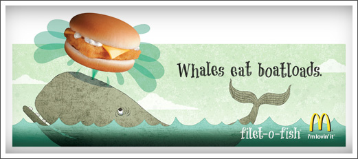
RAW TOAST DESIGN had been commissioned to do some illustrations for McDonalds in America. Their designs appeared on billboards in the USA, showing their style. I love the cool colours, it really looks light and friendly. It makes me want a fillet-o-fish. It makes me think that if I eat it, it will be delivious goodness from the sea! I love the texture used in the colours, its not just block colour, it has a graininess to it that adds crunch! It adds life! And I just love the simple designs, such as the simple thin lines on the fin of the whale, the lines around the eye, and his cute little teeth! Any child would love to see and eat this, and it certainly sells it to the consumer.

Advertising Illustration McDonalds Filet-O-Fish Whale © RAWTOASTDESIGN
I also chose to look at Tim Marrs as he did some murals for KFC and also designed the packaging on PEPSI cans.
I think this packaging, for the pepsi, is absolutely sublime, its got that gritty feel to the imagery. It makes me think that if I drank it, I would turn into this super awesome cool unstoppable woman, that could do anything, like stunt riding, playing guitar with the volume on max. Thats exactly what it is. The black, grey and blue with odd dash of white give that urban feel and the true colour of pepsi max comes through, its like its saying ''Take it to the max, drink Pepsi.''.


Both of these illustrators have a modern way of working. Raw Toast seem to use layers of textures, experimenting with different opacity's to really add to that dimension. Most of us love McDonald's but we understand that they are really trying to reach the market to children, and so using this illustrator and style absolutely fits perfectly. It has that design language, that anyone can connect to. Just as Fig Taylor had told us, we have to convey that style and keep it diverse and adaptable, and this is exactly what Raw Toast do. On comparing, Tim Marrs, although extremely comporary too, has a focus around older people, particularly teenagers and young adults, as the feel is very hipster, featuring a man with a guitar, a breakdancer, a DJ all with very fresh and modern fashion. The colours used in Tim Marrs are all contrasting, placed and layered, also using semiotics. This is all about KFC, and we can really feel the hunger within this piece. Contrasting, the cool colours and simple layered style of Raw Toast, you can feel that sea taste with the fillet-o-fish.

Another I'd like to look at is Office. They designed fanta's sparkling orange soft drink packaging.


This seems to have been created using illustrator. Using crisp blocks of colours, with off shading here and there. It reminds me of pop art, the striking colour and bursts of juice really add to that experience of fanta. Having used gradients in the blocks of colour, it adds well to the contrast of the orange blue, using bright splashes of pinks and greens. I think the illustrator really captured the flavour of fanta. I think this packaging was a similar concept to the KFC in terms of colour usage and block, vibrant, stand alone colours. Raw toast and Office seem to really know their stuff.

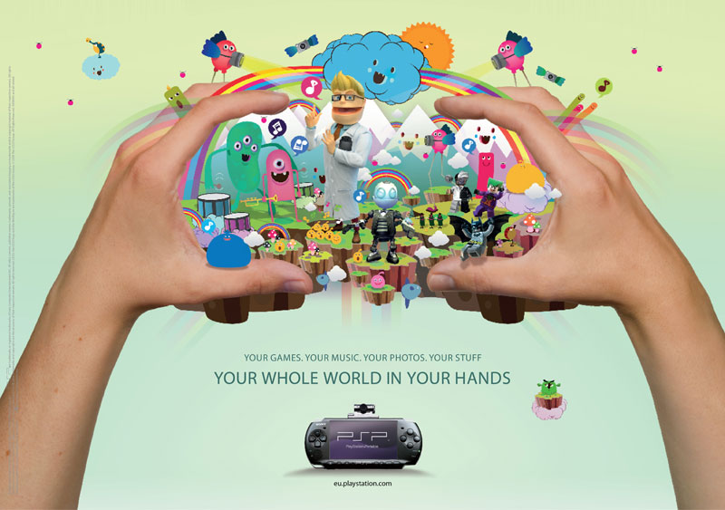
sony psp3000 advert illustration


I'm also going to look at is pokedstudio. They recently did an illustration for playstation which was then moved to an animation studio to be animated. It was an illustration used for advertising the PSP. 

playstation game


advert illustration clouds rainbows


This illustration was part of a print capaign for the release of sony playstation PSP 3000. It is an updated hand held gaming console that has lots of features and interactive qualities such as film, camera  and music players. The poster was designed with young players in mind, featuring pre-existing characters within the mural, from games that have already been released within the playstation network. There were other illustrators that were contracted to create more illustrations that were aimed at a variety of age groups. Completely and utterly beautiful with an array of colour, brightly decorated images, that give that floaty, dreamy, fantasy world of PSP an amazing dimension, and one that has a language that conveys to the younger audience.

Investigating the similarities and differences, I think all of these illustrations have one thing in common. A language of colour. All of them are able to grasp language and colour so perfectly, and are able to harness that power to portray a beauitful piece of imagery. If I had to say what was different, it would be that all of these pieces are unique, they have their own styles, although all contemporary.
I think the Fanta by Office and the pokedstudio are similar in terms of detail. They both use the blocked and contrasting colours with a gradient to give that smooth shaded feel. Both illustrations have layered pieces of imagery and characteristics that appeal to children.
The illustration by Raw Toast is just completely it's own, in differences of style and concept. I think Tim Marrs' is aimed at teenagers and older people, where as the Raw Toast illustration is appealing to early years, and foundation staged children, kids who are toddlers and around that age. I love his piece and I certainly think its my favourite out of the bunch, as its the only illustration with definitive keylines, and uses light textured colours.

I think if I ever come back to writing a blog about 4 different illustrations, I would choose children's books as there are alot more about them to talk about in terms of style, textures and text. I've enjoyed blogging about these 4 illustrations as the colour is so vivid. Its amazing how an illustrator can use semiotics in a way that can psychologically link to the viewer, such as with the fanta, I instantly think of juicy orange fizzy goodness! Its a powerful tool to use and a hard one at that, being able to instantly allow the viewer to relate to what they are seeing, and what they should be thinking of. I think as I grow more as an illustrator, the better I will learn this technique that these 4 illustrators have harnessed.


(1122 words)


Wednesday, 8 August 2012

Fig Taylor's Talk


DD2000 Design Practice: Fig Taylor's talk.


Thinking back to the talk we had by the very animated Fig Taylor, she had much to talk to us about, and teach. Being a well respected and renowned illustration agent, she had much to talk to us about, telling us about her job, how clients and agents would process portfolios of illustrators, arranging meetings etc. She would talk to her illustrators, telling them the do's and don'ts of the industry, teach them how to put portfolios together efficiently and effectively to meet standards that the industry demands.

She told us about how little work there is out there for illustrators, how there are a lot more illustrators than there are jobs. Despite this, we should always show who we are in our work, and like I've said before, it is also a language. A language which should translate to the viewer. We should enjoy our work and that we should learn to harness diversity and use it in our work. She told us of some illustrators she worked with, how she watched them grow and become a widely used name.

She went on through her talk and one thing I want to highlight is that she said is making a appointment with your clients and agents and talking to them in person is a very good thing to do, it allows your to make an impression, as you have to remember that they deal with thousands of illustrators all the time, you need to stand out.

Going back onto portfolios, she advised that we use only A3 and A4 sized portfolios, and that we shouldn't use any bigger, as it will just become in the way, hard to maneuver and the client won't be very impressed. You should be manageable and tidy. With that in mind, keeping whats in our portfolios in check is just as important. The work you include should never be years old, keep it recent, and modern. Only put in work your confident with and proud off, never just throw in any old rubbish. They should flow, and never put in something completely different to any of your other pieces at the front of your portfolio, as they will be the most memorable, keep it similar at the front, and your different ones and weakest at the back.

The talk by Fig Taylor was incredibly relevant, she answered all my questions to do with the industry, the relationships between illustrators and clients and also that we should be confident in ourselves. She was a very impressionable woman, and lovely. I absolutely enjoyed the talk, and would have loved to have more time with her!


(439 Words)

Tuesday, 31 July 2012

DD2000: Design Practice: Ben Tallon's Talk


Casting our minds back to the talk of the successful and multi-award winning illustrator Ben Tallon, who previously graduated from our course, he told the class about the industry from his perspective, the trials he had faced and how much hard work he had put into becoming the contemporary illustrator he is today. And we were not disappointed.

Having struggled to find my own style, Ben told us how he had found his feet in illustration. He covered several points, like we should not force ourselves into a style, that we find it with experimentation, open minds and hard work. As illustrators, we should be open-minded, experiment freely with various mediums in order to adapt to the client's needs. He had told us how even after he graduated, he was still finding his style. How some people find their style quicker than others, some just take longer. Each disciplinary has different directions, image-making and ways of creating illustrations for their client's desires.

Tallon's talk has had a lot of influence on me, making me realise more about my own style. Having a very contemporary style, his splashes of colour here and there adds a dynamic to his art. Bold and bright colours with different types of brush strokes add to the effect. He started by experimenting with different layers of textured papers, plastics, anything he could layer. He would scan these into photoshop and layer different mediums like spray paints or acrylics. Once scanned in, he would digitally layer and manipulate his images. Its not about putting things in random places, its about creating a language through his art that reads to the receiver in the right way. Making the eye flow and follow the direction of the art.

He spoke about his work, about clients he had worked for and how he had found work. One of which was a job for E4's Skins. He told us how he invited himself to the art directors home for dinner, introduced himself, it was a very amusing story. He taught us how we shouldn't limit ourselves, that we can achieve anything if we put our minds to it.

He spoke about the image-making himself. Contrasts of colours and lines. Mark making. His style involves bold lines, layered images digitally. Contrasts of splashes of colours in the right places. His style isn't so much about being neat, his lines have that 'accidentally on purpose' feel to them. They're unique. They have style and they are very contemporary in design. They're not traditional illustrations, very modern and stylish.

He spoke about creating our own independent space to work in, to help develop ourselves as illustrators and to become independent, to help get us into the swing of an illustrators lifestyle. He told us about how work in the beginning isn't so plentiful, and how jobs for editorials and such are always fought over. He suggested that beginning freelance illustrators should aim to get work with a known agency, to help direct us and get used to the industry, as there are alot of do's and don'ts. These include being reachable and adaptable as possible. Being able to mould ourselves is very important as illustrators, as we are only restricted by our own skills. He said for many years he would have a part-time job as he would never know when his next job would be, to keep funds flowing to supply his artwork and his home.

Being a freelance illustrator is a very demanding job and needs extra special attention to help nurture our skills, to keep up to date with new and upcoming illustrators in the contemporary and modern world, to keep up to date with clients and to help spread our client base to not just within the UK but to think about other countries too and not to limit ourselves.

His talk has helped me alot as an illustrator, it has opened my mind to more possibilities, not just within myself but in my style and experimentation. We should not limit ourselves and we should embrace the different and new. Ben Tallon has taught us all more about illustration, the industry and about ourselves.


(695 words)

Thursday, 12 January 2012

Black Swan White Lies Illustration

Ou


First picture is the outline.
Second is the rough of digital painting.
Third is the final of the digital painting.
Fourth is the start of a styled/graphic portrait
Fifth is pretty much experimenting with brush and what not.

Firstly, I decided a digital piece would be ideal as I'm trying to pick up on my strengths this term, rather than experimenting with stuff that I'm terrible with in hope of reaching a somewhat satisfactory level.

So it started when I read the little white lies brief. I could select 1 film out of 5 choices, and I chose the black swan.
Watched the film.
Took inspiration and obvious symbols noted.
Blah blah.

So I chose a shot from the film of natalie portman dancing as the white swan turning into the black swan, where by her prince has chosen the wrong princess and shes all '' Oh nooo! ''.
Anyway in the shot she looks like shes running away, with a scared/shocked expression.


The reason I took such a big jump from the smooth digital painting to the gritty one is simply because the first one is not of a high standard, and it didn't really go down well.
After talking for awhile with Illustrator Sleepy Wolf AKA John Chan, http://www.facebook.com/thesleepywolf
He highlighted the reasons that it was bad etc and showed me a few tips on layering and playing with opacity in shadows etc.

Anyway, yeah, my new soluton is the crazy gritty one, having played with effective brushes etc, adding some feathers in to give it that swan feel. I think its a much better solution.