DD2000 - Design Product - Advertising
After working on advertising illustrations for a brief, I've decided that comparing and contrasting illustrators that have worked on advertising illustrations, I thought it to be relevant. After looking through various illustrators, I decided on a few that caught my eye.
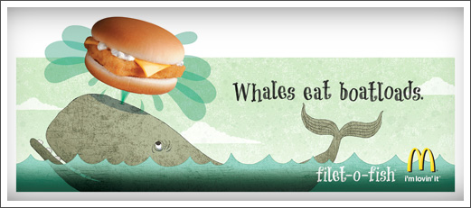
RAW TOAST DESIGN had been commissioned to do some illustrations for McDonalds in America. Their designs appeared on billboards in the USA, showing their style. I love the cool colours, it really looks light and friendly. It makes me want a fillet-o-fish. It makes me think that if I eat it, it will be delivious goodness from the sea! I love the texture used in the colours, its not just block colour, it has a graininess to it that adds crunch! It adds life! And I just love the simple designs, such as the simple thin lines on the fin of the whale, the lines around the eye, and his cute little teeth! Any child would love to see and eat this, and it certainly sells it to the consumer.
I also chose to look at Tim Marrs as he did some murals for KFC and also designed the packaging on PEPSI cans.

I think this packaging, for the pepsi, is absolutely sublime, its got that gritty feel to the imagery. It makes me think that if I drank it, I would turn into this super awesome cool unstoppable woman, that could do anything, like stunt riding, playing guitar with the volume on max. Thats exactly what it is. The black, grey and blue with odd dash of white give that urban feel and the true colour of pepsi max comes through, its like its saying ''Take it to the max, drink Pepsi.''.

Both of these illustrators have a modern way of working. Raw Toast seem to use layers of textures, experimenting with different opacity's to really add to that dimension. Most of us love McDonald's but we understand that they are really trying to reach the market to children, and so using this illustrator and style absolutely fits perfectly. It has that design language, that anyone can connect to. Just as Fig Taylor had told us, we have to convey that style and keep it diverse and adaptable, and this is exactly what Raw Toast do. On comparing, Tim Marrs, although extremely comporary too, has a focus around older people, particularly teenagers and young adults, as the feel is very hipster, featuring a man with a guitar, a breakdancer, a DJ all with very fresh and modern fashion. The colours used in Tim Marrs are all contrasting, placed and layered, also using semiotics. This is all about KFC, and we can really feel the hunger within this piece. Contrasting, the cool colours and simple layered style of Raw Toast, you can feel that sea taste with the fillet-o-fish.
Another I'd like to look at is Office. They designed fanta's sparkling orange soft drink packaging.

This seems to have been created using illustrator. Using crisp blocks of colours, with off shading here and there. It reminds me of pop art, the striking colour and bursts of juice really add to that experience of fanta. Having used gradients in the blocks of colour, it adds well to the contrast of the orange blue, using bright splashes of pinks and greens. I think the illustrator really captured the flavour of fanta. I think this packaging was a similar concept to the KFC in terms of colour usage and block, vibrant, stand alone colours. Raw toast and Office seem to really know their stuff.
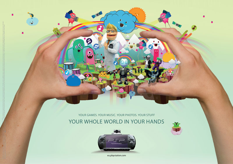
I'm also going to look at is pokedstudio. They recently did an illustration for playstation which was then moved to an animation studio to be animated. It was an illustration used for advertising the PSP.


This illustration was part of a print capaign for the release of sony playstation PSP 3000. It is an updated hand held gaming console that has lots of features and interactive qualities such as film, camera and music players. The poster was designed with young players in mind, featuring pre-existing characters within the mural, from games that have already been released within the playstation network. There were other illustrators that were contracted to create more illustrations that were aimed at a variety of age groups. Completely and utterly beautiful with an array of colour, brightly decorated images, that give that floaty, dreamy, fantasy world of PSP an amazing dimension, and one that has a language that conveys to the younger audience.
Investigating the similarities and differences, I think all of these illustrations have one thing in common. A language of colour. All of them are able to grasp language and colour so perfectly, and are able to harness that power to portray a beauitful piece of imagery. If I had to say what was different, it would be that all of these pieces are unique, they have their own styles, although all contemporary.
I think the Fanta by Office and the pokedstudio are similar in terms of detail. They both use the blocked and contrasting colours with a gradient to give that smooth shaded feel. Both illustrations have layered pieces of imagery and characteristics that appeal to children.
The illustration by Raw Toast is just completely it's own, in differences of style and concept. I think Tim Marrs' is aimed at teenagers and older people, where as the Raw Toast illustration is appealing to early years, and foundation staged children, kids who are toddlers and around that age. I love his piece and I certainly think its my favourite out of the bunch, as its the only illustration with definitive keylines, and uses light textured colours.
I think if I ever come back to writing a blog about 4 different illustrations, I would choose children's books as there are alot more about them to talk about in terms of style, textures and text. I've enjoyed blogging about these 4 illustrations as the colour is so vivid. Its amazing how an illustrator can use semiotics in a way that can psychologically link to the viewer, such as with the fanta, I instantly think of juicy orange fizzy goodness! Its a powerful tool to use and a hard one at that, being able to instantly allow the viewer to relate to what they are seeing, and what they should be thinking of. I think as I grow more as an illustrator, the better I will learn this technique that these 4 illustrators have harnessed.
(1122 words)

